
Coordinating Furniture and Decor Colors is one of the key elements that determine the success of interior design in a home. It is not only about adding aesthetic touches, but its impact extends to the overall mood and psychological comfort of the residents. Colors can change the atmosphere of a space, making rooms appear larger or cozier, more relaxing or vibrant, depending on the color choices and how they are coordinated. In this context, Loft Store offers a wide range of furniture and decor items that help you coordinate colors perfectly. The store features unique designs in both soft and bold colors, allowing you to create a visual harmony that adds elegance and comfort to every corner of your home. In this article, we will explore the impact of colors on the overall mood of the house, the importance of harmony in decor, and highlight how to choose colors in a way that provides both comfort and beauty.
Basics of Coordinating Furniture and Decor Colors
Coordinating furniture and decor colors requires a deep understanding of some basic rules to ensure you achieve visual and aesthetic balance in your home. Here are some essentials to help you achieve that:
Understanding the Color Wheel
The color wheel is an essential tool for understanding the relationship between colors. It consists of primary colors like red, blue, and yellow, which can be mixed to create secondary colors such as orange, green, and purple. By using complementary colors (opposite on the wheel), like blue and orange, you can create bold contrast that enhances the beauty of the design.
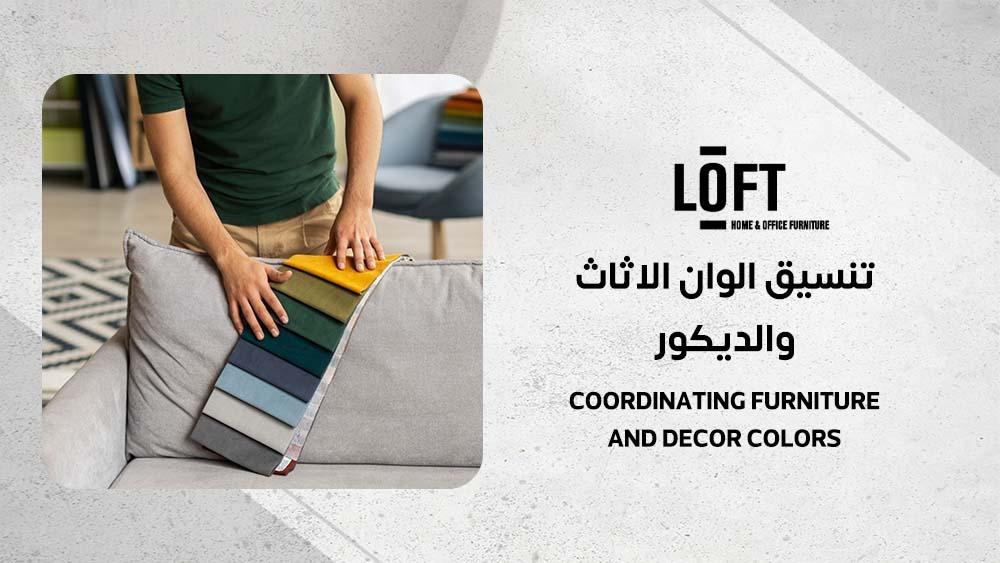
Coordinating Furniture and Decor Colors with the 60-30-10 Rule
The 60-30-10 rule is one of the most important rules in coordinating furniture and decor colors. According to this rule, the main color should cover 60% of the space, such as walls or floors. The secondary color covers 30%, like furniture and curtains, while the accent color takes up 10% in accessories and cushions. An example of this: Beige walls at 60%, gray furniture at 30%, and yellow cushions at 10%.
Neutral Colors: The Perfect Foundation
Neutral colors like white, gray, and beige are the foundation of interior decor coordination. They are versatile and fit all design styles, from modern to classic. For instance, light gray can be used as a background to highlight bright, bold colors in a room.
Coordinating Colors by Room Type
Coordinating furniture and decor colors is not about randomly choosing colors but requires considering the type and function of the room. In this section, we’ll discuss how to coordinate colors in different rooms of the home to achieve the best visual impact and psychological comfort.
Living Room
The living room is a family gathering space, so it’s important to choose a focal point, such as a fireplace or window, to determine the color scheme. Colors like navy blue reflect a refreshing maritime feel, while olive green gives a sense of comfort and warmth for a rustic style. Tip: To add a pop of life without significant cost, you can add colored cushions on sofas.
Bedroom
The bedroom is the perfect place for using calm colors like light gray or pastel blue, as these colors enhance relaxation. When choosing colors for the bedroom, it’s important to maintain balance: if the wall is dark, use lighter-colored furniture. For example, a charcoal headboard with light gray walls adds elegance and tranquility.
Kitchen
In the kitchen, wooden colors blend perfectly with white or creamy tones, contributing to brightness and cleanliness. Tip: You can use colorful accessories like red cookware or bright decorations to add a modern touch suitable for the contemporary atmosphere.
Add a modern chic touch to your living room with the Loft 3-seater modern white sofa + long armchair on the right, combining comfort and sleek design. Perfect for applying the 60-30-10 rule in color coordination, as it provides a neutral backdrop that highlights your colorful accessories.


The Role of Lighting in Coordinating Colors
Lighting is one of the most significant factors affecting coordinating furniture and decor colors, as it can dramatically change the appearance of colors. Whether it’s natural or artificial lighting, it has a significant impact on how colors look in different spaces.
Effect of Natural and Artificial Lighting
Warm lighting (like yellow light) makes colors appear warmer and more inviting, which makes neutral colors like beige and light gray look cozier and more comfortable. On the other hand, cool lighting (like bright white light) makes vibrant and lively colors like blue or red appear more vivid. Tip: Before making a final decision on colors, it’s advisable to test color samples in the room under different lighting conditions to ensure the colors will appear as desired.
Choosing the Right Lighting
It is essential to select appropriate lighting that complements the colors used in the room. For example, if you are using dark colors like dark gray or black, using strong lighting helps highlight those colors and makes them appear less intense and more balanced. LED lights or direct lighting can be used to achieve this effect. In rooms with neutral colors, you can add hidden lighting like built-in lights in surfaces or walls, which adds depth and beauty to the neutral colors and creates a comfortable, elegant atmosphere.
Coordinating Furniture and Decor Colors According to Design Styles
Coordinating furniture and decor colors is heavily influenced by the design style followed in the room. Each style has its own color preferences, which contribute to enhancing the overall mood of the space and making it suit your personal taste.
Modern Style
In the modern style, neutral colors like gray, black, and white dominate, with touches of metallic colors like silver and gold to add an element of luxury. Tip: To enhance the aesthetic, use furniture with clean lines and simple geometric shapes, along with glass accessories like vases or glass lights to add a touch of shine.
Classic Style
The classic style relies mainly on calm, elegant colors like beige, cream, and gold. These colors reflect luxury and comfort, making them a perfect choice for traditional spaces. Tip: Add white curtains with dark wooden furniture to bring a sense of grandeur and sophistication to the room.
Bohemian Style
The bohemian style is characterized by mixing vibrant colors like pink and turquoise with neutral tones like beige and brown, giving a sense of freedom and creativity. Tip: Use colorful rugs and patterned cushions to enhance the bohemian character and provide warm, colorful vibes in the room.
Practical Tips for Coordinating Colors
Coordinating furniture and decor colors requires some tricks and practical tips to ensure you achieve the best results in every room. Here are some tips to help improve your coordination effortlessly:
Using Accessories to Add Colorful Touches
Accessories like cushions, blankets, and paintings can add extra colors to the room without needing to change the furniture drastically. For example, placing blue cushions on a gray sofa adds a lively and refreshing touch to the space. These additions help change the atmosphere of the room at a low cost.
Experimenting with Colors Before Committing
It’s always important to test colors before making a final decision. You can use paint samples or programs like Coolors to experiment with colors virtually. Tip: Take a photo of the room and try colors using design apps on your phone to assess how the colors interact with the lighting and space.
Achieving Balance and Contrast
To achieve balance and contrast in coordinating furniture and decor colors, you should blend warm and cool colors harmoniously to avoid monotony. For example, combining brown furniture with light blue walls creates an attractive contrast between warm and cool colors, producing a balanced atmosphere.
Raise the elegance of your room with the NOWY COFFEE TABLE SET OF 2 from Loft, which adds a sleek modern touch. Perfect for coordinating colors according to a contemporary style, allowing surrounding colors to shine with appropriate lighting.


Frequently Asked Questions
What is the color distribution rule in decor?
The 60-30-10 rule is the most common, with the main color covering 60% (such as walls), secondary color covering 30% (such as furniture), and accent color covering 10% (such as accessories).
What color furniture goes with everything?
Furniture in gray or beige goes with all colors, as it is neutral and gives you flexibility in coordinating colors with the rest of the decor.
How do I coordinate colors with each other?
Coordinate colors using the color wheel, and choose complementary or harmonious colors to avoid excessive contrast and achieve a visually appealing balance.
What colors go with red in decor?
White and gray complement red, while gold or black add a touch of luxury and warmth.
In Conclusion
Coordinating furniture and decor colors is an art and science that anyone can master with time and practice. Don’t hesitate to experiment with new colors and play with them to add a personal, beautiful touch to your home. Use available tools like design apps or paint samples to try out the perfect coordination before making your final decision. If you’re looking for a wide variety of furniture and decor items with perfect colors to coordinate in your home, visit Loft Store to explore trendy options that suit all tastes. Start now and refresh your home with vibrant colors, beginning your coordination journey with every new piece.