
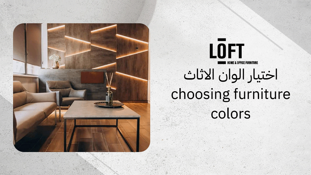
In today’s interior design world, choosing furniture colors has become more than just a matter of style—it’s a way to create harmony, balance, and a space that truly feels like home. The colors of your furniture can shape the entire visual experience of a room, influencing not only how it looks but how it feels. Whether designing a cozy apartment or a spacious home, selecting the right shades helps every element flow together naturally, turning simple interiors into inviting, cohesive environments.
How to choose furniture colors?
Choosing furniture colors is about achieving balance and harmony in every room. The key is to look at the space as a whole — its size, lighting, wall tones, flooring, and overall function. A thoughtful color scheme can make a space feel inviting, cohesive, and perfectly aligned with your style.
- Use the 60/30/10 rule to maintain color balance: 60% for the dominant color (usually walls), 30% for the secondary color (furniture or flooring), and 10% for accents such as décor or cushions.
- Coordinate shades based on color wheel principles — monochrome for subtle unity, analogous for smooth transitions, or complementary for contrast and vibrancy.
- Always consider the purpose of the room — the right palette can enhance focus, relaxation, or energy depending on its use.
- Keep the design style in mind: modern spaces often welcome bold contrasts, while traditional interiors tend to favor soft, neutral tones.
Why does room size matter?
Room size significantly affects how furniture colors appear. In smaller rooms, light shades help open up the space and create an airy feel. On the other hand, dark or bold colors can make large rooms feel warmer and more intimate, reducing the sense of emptiness and adding comfort.
How does lighting impact color?
Lighting changes how colors look throughout the day. Natural light reveals true hues, while artificial lighting — whether warm or cool — can shift tones dramatically. It’s best to test furniture samples under real lighting conditions to ensure they fit the atmosphere you want to achieve, both in daylight and at night.
What about wall and flooring colors?
Furniture should either blend harmoniously with the walls and flooring or create intentional contrast, making choosing furniture colors a key element in achieving a balanced interior design. Neutral wall tones like beige or gray provide flexibility for bolder furniture choices. Conversely, if the walls are vivid or patterned, choosing subtle furniture colors helps prevent visual clutter and maintains visual harmony and balance throughout the room.
How does color psychology affect choices?
Color psychology influences how a space feels and how people behave in it. Understanding emotional color responses helps you design rooms that support the right mood and purpose.
- Cool colors such as blue and green promote calmness, making them ideal for bedrooms or study areas.
- Warm colors like yellow and red create a sense of energy and sociability, perfect for living or dining areas.
- Neutral tones such as gray, beige, or taupe provide stability and help maintain focus in workspaces.
By aligning furniture colors with both the room’s function and its emotional intent, you can create a cohesive and purposeful environment that feels both comfortable and inspired.
What colors suit my space?
In smaller rooms, light furniture colors are the most effective choice to create a sense of openness and brightness, which makes choosing furniture colors an essential step in small-space design. Shades such as white, beige, or light gray visually expand walls and floors, reducing any feeling of confinement. These hues help bounce natural light around the room, making it feel more breathable and uncluttered. Minimal color contrast between furniture and walls also prevents the space from appearing busy and enhances overall visual harmony.
Which colors for large areas?
Larger spaces allow for deeper, richer furniture tones without overwhelming the environment. Navy, forest green, and charcoal are ideal for adding depth and warmth, ensuring the area feels cozy rather than stark or empty. Darker hues help anchor big rooms and create inviting focal points. They also provide an elegant contrast when paired with lighter walls or lofty ceilings, balancing proportions visually.
How to match existing décor?
When coordinating new furniture with your current décor, begin with neutral bases—think beige sofas, gray dining tables, or off-white cabinets. Then, layer in bold accents or natural tones through secondary pieces like chairs, cushions, or décor elements. Always test color swatches in your actual room under morning, afternoon, and evening lighting to confirm how tones behave throughout the day.
For open-plan layouts, maintaining a consistent color flow is essential, making choosing furniture colors a key factor in ensuring smooth and seamless transitions between different areas. Matching furniture colors with walls, flooring, and architectural details using similar undertones creates subtle harmony throughout the space. Lastly, consider your interior style when choosing furniture colors: modern settings pair beautifully with earthy greens and calming blues, while timeless homes shine with crisp whites and natural wood finishes that never go out of style.
What role do natural and neutral colors play?
Neutral colors such as white, beige, and gray form the foundation of many beautiful interiors. They reflect light gracefully, giving rooms a bright and open feel, and their timeless quality ensures the space never goes out of style. Because they are so adaptable, it’s easy to refresh the décor later with new accessories or accent shades without changing the main furniture pieces. In small rooms, lighter neutrals visually expand space, while in larger areas, deeper tones like taupe or charcoal introduce a cozy, grounded ambiance.
Natural colors like green and blue bring a sense of renewal and serenity that mirrors nature’s calming influence. Shades of soft sage, sky blue, or muted teal help create a tranquil mood that supports relaxation and well-being. These tones evoke freshness and balance, making them perfect for spaces where people unwind and gather.
How to use neutral tones?
Using neutral tones effectively means treating them as a flexible canvas, which makes choosing furniture colors a thoughtful process rather than a random decision. Selecting core furniture items—such as sofas, rugs, and cabinets—in soft whites, beige, or gray helps maintain visual consistency throughout the room. Neutral bases allow for easy layering of textures through wood, linen, or woven textiles, adding depth and warmth without visual clutter. They also enhance light reflection, improving overall brightness and creating a smooth, spacious flow within the interior.
How do natural colors impact mood?
Natural colors influence how you feel in a space by simulating natural settings. Gentle greens recall gardens and forests, while oceanic blues bring a sense of calm and mental clarity. These hues subtly lower stress and encourage peaceful energy, which is why they work wonderfully in living rooms, bedrooms, or reading corners.
What about mixing both?
Blending neutrals and natural shades introduces harmony and interest. For example, pair a neutral sofa with green or blue cushions, add a few lush plants, or use a soft gray carpet to anchor olive or midnight-blue walls. This approach balances vibrancy and calm, preventing the monotony of an all-neutral scheme and the intensity of too much color. Layering both palettes with wood furniture or natural fabrics strengthens the organic character, making the room feel cohesive and alive.
How to achieve balance in color selection?
A balanced interior color scheme often follows the 60/30/10 rule, a simple yet effective approach to choosing furniture colors. Begin with a dominant color that covers about 60% of the space—this usually applies to walls, large furniture pieces, or flooring. Then, complement it with a secondary color occupying around 30%, often through rugs, curtains, or medium-sized furnishings. Finally, introduce an accent color in small touches—roughly 10%—through cushions, artwork, or decor accessories.
This method ensures a cohesive look while adding layers of depth and personality. Limiting your palette to three main colors prevents visual chaos and keeps the room harmonious.
How to use contrast effectively?
Balancing contrast is key to preventing a space from looking either too flat or overwhelmingly bold. Pairing cool and warm tones can create a more inviting and visually dynamic environment. Neutrals serve as excellent anchors, providing calm stability while allowing natural tones to bring freshness and vitality. When dealing with open-plan areas, maintaining color continuity between zones keeps the flow smooth and visually consistent.
- Use gentle contrasts between light and dark shades to define zones without harsh separations.
- Combine complementary colors from the color wheel for a bolder, more lively impact.
- Apply textured materials—like wood, linen, or metal—to add depth without adding more color.
How to test color combinations?
- Collect swatches of paint, fabric, and flooring samples to visualize how shades interact in real light.
- Observe them under different lighting conditions, both natural and artificial, throughout the day.
- Assemble a sample board, arranging materials side by side to check how the hues balance together.
- Review the palette within adjacent spaces to confirm consistency, especially in open layouts.
- Refine the scheme using a color wheel to identify the most harmonious or complementary combinations.
These steps help ensure the chosen colors work together seamlessly, enhancing the space with balanced charm and a cohesive aesthetic.
What are the best furniture options for color harmony?
When choosing furniture colors, balance plays a crucial role in creating spaces that feel both appealing and cohesive. Loft Furniture offers beautifully designed pieces that embody the essence of color harmony — thoughtful tones, natural materials, and versatile forms that adapt effortlessly to various interior styles. Two standout examples from their collection perfectly illustrate this approach.
Arch Sofa by Loft Furniture
The Arch Sofa from Sofas section blends an earthy green fabric with warm walnut legs, striking a fine balance between bold color and natural wood. Its soft curves, rounded arms, and dimensions of 230x100x76 cm bring a gentle contemporary energy to living rooms. The green hue feels fresh yet grounded, inviting a calm, welcoming mood that pairs wonderfully with cream, orange, cranberry, or soft blue accessories.
Built from sturdy wood and tightly woven fabric, this sofa also includes two adjustable cushions for everyday comfort. Its sleek but inviting design fits beautifully in both modern and casual interiors, adding depth without overwhelming the space. In open or spacious layouts, it becomes a striking centerpiece that ties together tones from different parts of the room.
Chilip Carpet Rectangular by Loft
The Chilip Carpet Rectangular from Carpets section complements color-focused interiors with its balanced ivory and grey palette and generous 200x300 cm size. Its gentle hues create a visual base that reduces noise and enhances furniture color harmony, letting bolder tones or textured materials stand out naturally. The pattern is understated yet rich enough to bring a soft rhythm to the floor.
Crafted from woven fabric using a flatweave technique, the carpet offers stability and an unfussy modern appeal that suits high-traffic areas. Whether placed under a bed, in a seating zone, or in an open-concept space, it anchors the room with warmth and quiet sophistication.
FAQs about choosing furniture colors
How to decide on furniture color?
When choosing furniture colors, start by identifying the dominant tone of your space—usually the wall color or flooring. Then, select shades that complement or contrast gently with that base to maintain harmony. Think about how natural light affects hues throughout the day and consider your desired mood, whether warm and cozy or modern and airy.
What is the 2/3 rule furniture?
The 2/3 rule in interior design suggests that two-thirds of the visual weight should belong to one main section—like a long sofa, large rug, or feature wall—while the remaining one-third balances the rest of the space. This proportion creates harmony and prevents a room from feeling either overcrowded or visually empty.
What is the 60 30 10 rule with 4 colors?
When applying the 60/30/10 rule with four colors, 60% of the room should feature the main color, 30% should include a secondary tone, and 10% should be reserved for accents. If a fourth color is used, keep it subtle—perhaps sharing a portion of the 10%—to maintain a cohesive and balanced look.
Conclusion
Choosing furniture colors is a thoughtful process that blends practicality with creativity. By paying attention to room size, lighting, style, and overall color balance, you can create interiors that feel cohesive and inviting. When chosen with care, furniture colors not only complement your space but also express your personality and sense of comfort.