
Imagine walking into a room where every shade, texture, and tone feels perfectly balanced — a space that not only looks beautiful but also feels right. That’s the power of color coordination in home furniture. The way colors interact in your living environment can influence comfort, mood, and even your sense of harmony. Whether warm neutrals invite relaxation or vibrant hues spark creativity, the psychology of color plays a subtle yet powerful role in shaping how you experience your home.
Why is color coordination important?
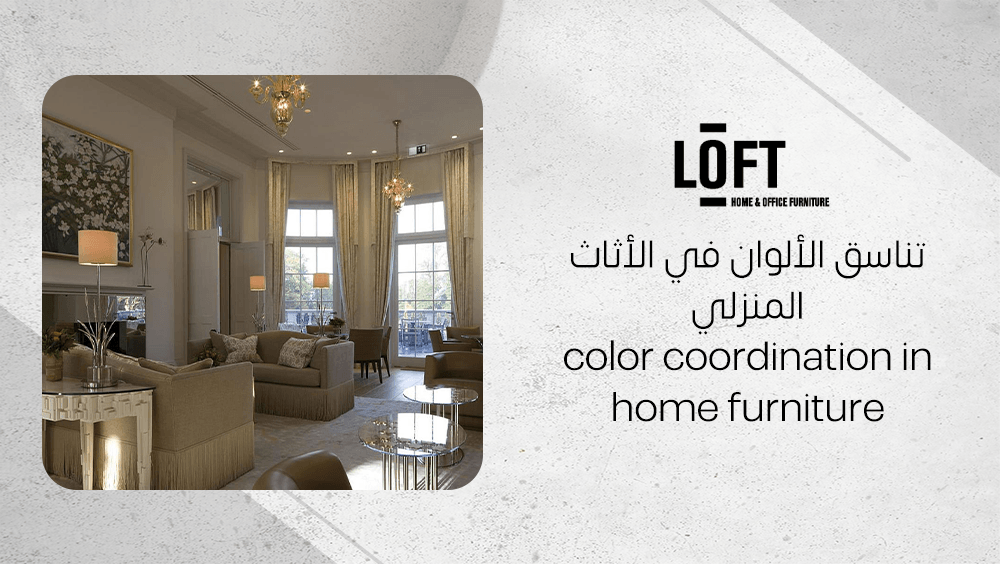
Color coordination in home furniture goes far beyond simple decoration — it shapes how a space feels and functions. When furniture colors align harmoniously, rooms feel balanced, organized, and emotionally attuned. Coordinated tones can turn an ordinary setting into a sanctuary that supports rest, creativity, and connection.
A well-curated color palette also ensures that every corner of the home visually "speaks" the same language. It enhances flow between spaces, reduces visual clutter, and makes interiors more comfortable to inhabit day after day. In short, color coordination is both an aesthetic and emotional anchor for the entire home environment.
How does color impact comfort?
Color directly affects how comfortable and relaxed people feel in their living space. Thoughtful coordination can nurture serenity or warmth depending on the desired atmosphere.
- Warm hues like red and orange infuse rooms with coziness and intimacy, making them perfect for social areas like living rooms or dining spaces.
- Cool colors such as blue and green evoke calmness and freshness, ideal for bedrooms or reading corners.
- A balanced blend of warm and cool shades maintains emotional equilibrium, helping reduce everyday stress and creating a sense of harmony.
- Consistent color coordination in furniture, walls, and accents fosters a stable psychological environment where relaxation comes naturally.
How does color boost visual appeal?
Color harmony instantly elevates the visual charm of home interiors, highlighting the importance of color coordination in home furniture in creating a cohesive look. When furniture colors are carefully coordinated with wall tones and decorative accessories, the entire space feels unified, balanced, and aesthetically satisfying—transforming individual pieces into a harmonious design story rather than isolated elements.
- The neutral base approach—using whites, beiges, or light grays—offers visual rest and allows the eyes to travel smoothly across the room.
- Accent colors in cushions, rugs, or artwork add vibrance without overwhelming the senses.
- Applying complementary or triadic palettes enhances visual rhythm, giving balance and depth to the design.
- Matching furniture finishes with wall undertones strengthens cohesion, making the overall look refined, timeless, and effortlessly appealing.
What are the fundamentals of color coordination?
The 60-30-10 rule is a simple yet powerful guideline for achieving balanced color coordination in home furniture. It divides your space into three dominant color percentages that create flow and visual comfort.
- 60% primary color usually applies to the major elements — the walls, flooring, or large furniture pieces like sofas. This shade sets the overarching tone of the room.
- 30% secondary color adds contrast and depth. Think of a blue rug lying beneath a neutral sofa — it stands out but still complements the main palette.
- 10% accent color introduces personality through smaller decor pieces such as cushions, lamps, or artwork.
By distributing shades in these ratios, you avoid visual clutter and let every tone serve a purpose. This approach ensures a sense of unity across the space while leaving room for creativity through accents.
How do contrast and harmony work?
Contrast and harmony are the twin forces that make color coordination visually satisfying. They determine how colors interact and how the eye travels through a room.
- Harmony occurs when similar tones—like whites, greys, and beiges—flow seamlessly to form a calm, cohesive look. These neutrals create a soothing base that supports other colors.
- Contrast introduces energy and depth. For instance, against those neutral shades, a blue area rug instantly adds character, anchoring the space without overpowering it.
- Balance emerges when both aspects coexist — coffee tables in soft neutrals can temper bold elements, ensuring the design feels intentional rather than chaotic.
Understanding this interplay lets you design spaces that feel both engaging and comfortable, without overwhelming the senses.
How does furniture type affect color picks?
The type of furniture — its material, weight, and texture — has a strong influence on color choice. Heavier materials like solid wood or leather work beautifully with darker tones, giving them a grounded, sophisticated appeal. In contrast, lighter hues suit fabric or delicate pieces, enhancing their softness and preventing them from visually dominating the room.
When choosing shades for furniture, consider not just the color itself but how it complements the material’s natural texture and the overall balance of the room’s palette. This thoughtful coordination ensures every item feels part of the same story.
How does color coordination influence well-being?
Thoughtful color coordination in home furniture does more than refine the aesthetic—it subtly shapes emotions and mental comfort. A room painted in calm, neutral tones like soft grey or warm beige promotes a sense of peace, allowing the mind to rest. In contrast, the clever placement of bright accent pieces—perhaps a yellow armchair or coral cushion—can lift the mood and infuse energy into the space. When colors are balanced rather than competing, the environment feels cohesive, fostering serenity and well-being.
How do colors set the mood?
Colors communicate emotional cues instantly. Gentle hues help the mind unwind, while vibrant shades awaken creativity and liveliness. The right palette sets an unspoken emotional tone that influences daily experiences.
- Soft blues or muted greens evoke calm, making them ideal for bedrooms or living rooms.
- Warm neutrals like beige and taupe create a grounding atmosphere, perfect for shared spaces.
- Pops of orange or yellow can invigorate dining or work areas, keeping energy levels high.
- Blue rugs or throws can introduce serenity into bustling rooms, stabilizing the overall feeling of balance.
How do you achieve psychological balance?
Psychological harmony arises when contrasts complement rather than clash. Pairing darker walls with lighter or cheerful furniture creates visual rhythm and emotional steadiness, preventing heaviness or monotony. Blue, in particular, serves as a grounding secondary color—it soothes the senses while anchoring other tones around it. When hues transition smoothly and maintain a gentle dialogue, they ease tension, allowing the home to become a restful, restorative retreat.
Which lighting enhances color coordination?
Lighting can completely transform the way colors appear in your home. The same sofa that looks cozy and balanced in daylight might feel dull or overly warm under artificial light. Understanding how different lighting types interact with your furniture tones helps you enhance overall color coordination in home furniture effortlessly.
- Natural light reveals the truest version of any color and shows how it changes throughout the day.
- Artificial lighting adds mood and personality but can warm, cool, or even distort certain hues.
- Testing color choices under multiple light settings prevents mismatched tones or uncomfortable color tension.
How does light affect color?
Light is what gives color its life. As sunlight moves throughout the day, it subtly shifts from cool morning brightness to warm evening glow. This natural variation helps you see the genuine depth of your furniture hues. Without it, even the most carefully chosen palette may appear off-balance.
The direction and intensity of your light sources play an equally important role. A north-facing window, for instance, often casts bluish tones, while a lamp placed too close to a wall can create shadows that distort color perception. Observing how light falls on different materials—whether glossy, matte, or textured—reveals how coordinated the colors truly appear.
What types of lighting work best?
For precise color harmony, natural daylight is unmatched, making it a key factor in color coordination in home furniture. Daylight provides the most accurate color reflection, allowing you to clearly see the true relationship between fabrics, wood finishes, and wall shades. However, since most daily living happens after sunset, it’s equally important to test your furniture and color combinations under artificial lighting to ensure that color coordination in home furniture remains balanced and appealing at all times of day.
Warm artificial lighting, such as from incandescent or warm LED bulbs, enhances amber, beige, and earthy tones. It softens neutrals, making spaces feel inviting and comforting. In contrast, cool or strong white lighting accentuates blues, grays, and sleek surfaces, emphasizing a crisp, modern vibe.
To make confident design decisions, always test color samples both in daylight and under evening lights before committing. You’ll quickly notice how the mood—and even furniture balance—can shift between the two.
How to apply color coordination in your home?
Color coordination in home furniture begins with a thoughtfully built palette that connects every element in your space. A cohesive color plan helps your rooms feel balanced and visually connected rather than filled with unrelated pieces.
To define your palette, follow these simple steps:
- Pick a dominant neutral for the largest surfaces such as walls, floors, or your main sofa. Shades like beige, white, or soft grey create a calm foundation.
- Add a secondary color — consider tones like navy, olive, or terracotta for rugs, armchairs, or cabinetry. This layer introduces character and personality.
- Choose an accent shade that pops through pillows, curtains, artwork, or small décor pieces. Vibrant touches of mustard, teal, or coral can instantly lift the mood.
When applying these colors, many designers use the 60-30-10 rule:
- 60% dominant neutral
- 30% secondary tone
- 10% accent color
This proportion keeps the overall scheme balanced and easy on the eyes. It’s also wise to test your color combinations under different lighting throughout the day — natural and artificial light can shift how colors appear.
How to coordinate furnishings and accessories?
Once your palette is set, use it as a guide for connecting furniture and décor. Consistency doesn’t mean everything must match; the goal is smooth harmony among materials and hues.
Consider these practical tips when planning your space:
- Match similar undertones: a white coffee table pairs beautifully with a cool blue rug and soft grey accessories.
- Repeat your accent color in small touches — maybe through cushions, a framed print, or a ceramic vase.
- Keep your curtains in sync with the secondary tone to visually tie upper and lower room elements together.
- Always evaluate pieces beside one another before committing, checking how fabrics and surfaces interact under daylight and evening light.
- Finally, let your chosen style lead the direction — whether you lean towards modern minimalism, classic warmth, or the simplicity of Scandinavian design, your color coordination should mirror that personality.
With these steps, your home becomes a unified composition where every shade and shape contributes to a thoughtfully designed atmosphere.
What are the best color-coordinated furniture pieces?
When thinking about color coordination in home furniture, Loft Furniture stands out as a go-to destination for modern and versatile pieces that harmonize hues and textures beautifully. Each design is thoughtfully crafted to help you build spaces that feel balanced, stylish, and cohesive — the essence of smart color pairing.
Square Coffee Table with Melamine Tabletop & Dark Grey Steel Legs
This Square Coffee Table from Loft Furniture brings together functionality and visual elegance with its light, neutral-toned melamine surface — available in white or soft grey. These shades make an excellent base for any modern palette, whether you’re leaning towards airy Scandinavian tones or a clean industrial feel.
Its slightly rounded corners soften the look, while the dark grey steel legs add just the right amount of contrast, grounding the design without weighing it down. The interplay between light and dark tones makes it a great example of color balance. Plus, it’s scratch-resistant, easy to clean, and built for living rooms that stay lively and active.
Citadel - II Blue Area Rug
The Citadel - II Blue Area Rug introduces serenity into your lounge through its muted blue tone and understated geometric border. The color choice is clever — subtle enough to blend with neutral themes yet rich enough to complement bolder rooms without overwhelming the space.
Its smooth, tightly woven texture offers comfort underfoot while resisting glare for a refined matte finish. Sized at 200x300 cm, it fits perfectly under coffee tables, linking your furniture into one harmonious composition. Whether used indoors or outdoors, this durable, low-profile rug defines cohesive living areas with quiet sophistication.
Frequently Asked Questions about color coordination in home furniture
How to coordinate furniture colors?
When coordinating furniture colors, think about temperature harmony. Pair cool shades like blue and green to create a refreshing flow, or match warm tones like beige with deep browns or oranges for a cozy feel. You can also go for a monochrome combination by using different shades of the same color — this adds depth while keeping the atmosphere unified and elegant.
What is the 60 30 10 rule with 4 colors?
The 60-30-10 rule is a timeless decorating formula that helps maintain visual balance. It means dedicating 60% of your space to a dominant color, 30% to a secondary shade, and 10% to an accent tone. Even if you choose four colors, make sure the fourth blends subtly within these ratios to avoid overwhelming the space. The goal is a harmonious mix where tones complement rather than compete.
What is the psychology of color in home decor?
Colors deeply affect the mood of your home. Bright, bold shades inject energy and vibrancy into a room, while softer, muted colors encourage calmness and relaxation. A warm palette can make a room feel welcoming, whereas cooler tones introduce a sense of tranquility. Understanding these emotional effects helps you design spaces that reflect the atmosphere you want to experience every day.
Conclusion
Thoughtful color coordination in home furniture transforms a house into a harmonious and welcoming home. By combining colors intentionally, you create a sense of comfort and visual unity that reflects personal style and emotion. Every shade and texture contributes to a balanced atmosphere, making each room not only aesthetically pleasing but also a true expression of who you are.