
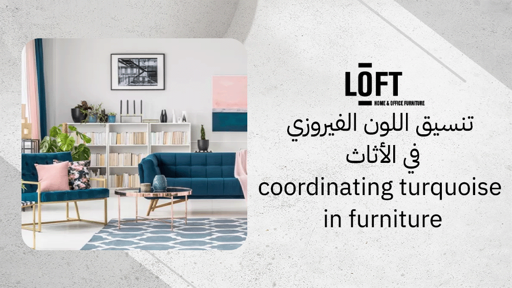
Imagine walking into a space that feels both refreshing and serene, where every element whispers of calm confidence. That’s the magic of coordinating turquoise in furniture. This color, with its blend of oceanic blue and vivid green, instantly draws attention without feeling overwhelming. It’s perfect for homeowners who crave personality in their interiors but still want to keep things balanced and modern. Whether it’s a turquoise armchair anchoring your living room or subtle accents across shelving and upholstery, the effect is undeniably captivating.
How to coordinate turquoise furniture?
Coordinating turquoise in furniture is all about balance and visual harmony. The shade naturally draws attention, so using it strategically keeps interiors fresh and stylish. You can spread turquoise through limited accents—pillows, throws, or a single statement chair—or go bold with a primary piece like a sofa against a neutral wall. Repeating small turquoise accessories—vases, lamps, or cushions—helps create a cohesive rhythm without overwhelming the room. Always ground turquoise with warm neutrals like beige, off-white, or light gray to maintain a calm, contemporary tone.
Where to use turquoise?
Turquoise furniture works beautifully in various settings, each gaining a distinct vibe from its touch of color.
- Living rooms: Try a turquoise sofa or accent chair to energize the space while keeping surrounding tones understated.
- Bedrooms: Cushions, ottomans, or curtains in turquoise add serenity without disturbing relaxation.
- Offices: A turquoise armchair or desk accessory can spark creativity and reduce stress during work.
- Kitchens: Small turquoise stools or ceramic details breathe freshness and brightness into neutral schemes.
How much turquoise is ideal?
Moderation is key when coordinating turquoise in furniture. Too much of this cool tone can make a space feel distant or overly crisp, while the right dose creates liveliness and comfort. Treat turquoise as either a focal point—like a statement armchair—or an accent, woven subtly through textiles and décor.
What materials enhance turquoise?
When coordinating turquoise in furniture, it pairs best with materials that mirror its natural allure while tempering its cool intensity. Wood, with its organic warmth, beautifully balances turquoise in tables, cabinets, or sideboards. Ceramic pieces, such as vases or lamps, further enhance coordinating turquoise in furniture by highlighting its artistic charm, while metal accents—especially brass or brushed gold—add a layer of subtle sophistication. Combining these materials supports coordinating turquoise in furniture in a way that creates a layered, welcoming feel, complementing turquoise and grounding its breezy freshness.
What are turquoise’s main design traits?
Turquoise sits beautifully between blue and green, radiating a sense of freshness and renewal. It’s often linked to modern design thanks to its crisp yet soothing presence that injects spaces with positive energy. The color naturally evokes images of tranquil waters and open skies, making it a favorite for those seeking balance between vibrancy and calm.
In interiors, turquoise has a remarkable ability to anchor a modern or coastal-inspired room. Whether used as an accent on furniture or as a statement wall, it lends energy without overwhelming the senses when applied thoughtfully. Its dual nature—both invigorating and serene—makes it adaptable to a wide variety of design moods.
What mood does turquoise create?
- It brings relief from tension by invoking associations with nature and open spaces.
- It stimulates creativity and fresh thinking, perfect for studios or dynamic work areas.
- It creates an impression of vastness and calm, helping interiors feel airy and uncluttered.
When can turquoise overpower a room?
Turquoise can dominate a space when it’s used excessively, such as covering entire walls or appearing in large furniture sets. In such cases, the hue may shift from refreshing to chilly, stripping away the coziness that rooms need to feel inviting. To maintain harmony, balance turquoise with textured fabrics, natural wood tones, or other warm shades. These elements soften its intensity and reintroduce warmth while preserving the modern, lively charm that turquoise brings.
What color combinations work best?
When coordinating turquoise in furniture, the magic lies in pairing it with the right supporting shades. Whether neutral or bold, each color story brings a distinct ambience to your space.
Which neutrals pair with turquoise?
- White or cream: These hues give turquoise room to shine. The blend feels refreshing and clean—imagine white sofas dressed with turquoise pillows that instantly lift the mood.
- Light or dark gray: A modern choice that grounds turquoise beautifully. Gray tables paired with turquoise chairs strike a cool, contemporary harmony.
- Brown or wood tones: Natural wood introduces warmth and contrast. Think of brown wooden frames against turquoise cabinetry—it’s a balance between earthy comfort and cool sophistication.
Neutrals like white, gray, and beige also make perfect backdrops for turquoise ceramic accessories, helping them pop without overwhelming the space.
Which bold tones accent turquoise?
- Mustard yellow: Brings an eclectic, cheerful energy that energizes turquoise’s tranquil character.
- Charcoal: Creates a sleek, urban edge—perfect for those who love a moody yet polished aesthetic.
- Soft blush or navy: Each offers a different flavor of contrast; blush tones soften turquoise’s brightness, while navy deepens the palette with elegance.
Layering turquoise with white, black, or beige can also add depth and variation, preventing the look from feeling flat.
How do wood and metallics interact with turquoise?
When coordinating turquoise in furniture, wood and metal can dramatically influence the visual temperature of the color. Natural wood tones—such as oak, walnut, or teak—soften turquoise’s coolness by adding organic warmth and texture. Metal finishes, on the other hand, bring a sharp contrast that elevates the overall look. Gold accents introduce a sense of luxury and warmth, while silver or chrome details create a sleek, modern feel. Together, these materials balance turquoise’s vibrancy, resulting in interiors that feel both grounded and dynamic.
How does contrast highlight turquoise?
When coordinating turquoise in furniture, contrast is what gives turquoise its magic. Against the right background, this vivid tone appears to glow, adding depth and freshness to modern interiors. Thoughtfully planned lighting further enhances coordinating turquoise in furniture, allowing turquoise furniture or accents to command attention without overwhelming the space.
- Using contrast—between bright turquoise and calm, neutral surroundings—helps define shapes and draw the eye naturally.
- Lighting matters just as much: reflective surfaces and soft illumination prevent the color from looking flat or dull.
- The best results come from balancing energy and calm—letting turquoise shine as the bright element while the rest of the palette stays muted.
Why use white as background?
White acts like a light amplifier. Whether it’s a ceramic wall or a polished floor, the reflectivity of white surfaces bounces light around the room, making turquoise seem richer and more luminous. When you place turquoise cushions or artwork against a crisp white backdrop, the color looks cleaner, fresher, and full of depth, creating that effortless modern vibe.
How do neutral woods help?
When coordinating turquoise in furniture, neutral woods—such as beige, taupe, or soft oak—add warmth without stealing attention. Their earthy undertones create a calm canvas that allows turquoise to stand out beautifully. In interiors rich with wooden textures, a turquoise accent chair or lamp becomes the star piece, while the surrounding natural hues support coordinating turquoise in furniture by enhancing its vibrancy rather than competing with it.
Where should turquoise be the focal point?
- Accent chairs or stools: Use turquoise upholstery in a room dominated by wood tones to create a playful yet balanced contrast.
- Cushions and throws: Layer them on a white or beige sofa to instantly inject energy without changing the entire palette.
- Wall art or decorative vases: Place turquoise pieces against white or light walls to attract the eye and brighten the atmosphere.
- Rugs or small furniture items: Keep everything else neutral to let the turquoise detail guide the mood of the room.
The golden rule? Use neutral or reflective bases, let turquoise be the singular burst of color, and avoid overcrowding the palette. That’s how the shade stays bold yet harmonious.
What are the best turquoise-friendly furniture pieces?
When coordinating turquoise in furniture, balance is key — the surrounding pieces should enhance, not compete with, its vibrant energy. At Loft Furniture, every design is curated to harmonize color and form, making it easier to highlight turquoise accents in modern or urban interiors with effortless sophistication.
WALTZ SIDEBOARD
The WALTZ SIDEBOARD from the storage section is the perfect foundation piece for showcasing turquoise décor. With a beige MDF body, a travertine ceramic top, and chocolate-finished metal legs, it grounds the space with warmth and understated elegance. Its clean geometry and soft curves make turquoise accessories or wall color look vivid and refined, never overwhelming.
Because it combines open and closed storage, you can style a turquoise vase, glassware, or art piece on the surface while maintaining a clutter-free look. Whether you place it in the living room, dining area, or entryway, this sideboard’s minimal tones and modern structure create the ideal backdrop for turquoise to shine.
White Ceramic Cactus Décor – H0126W
For a smaller yet equally striking accent, the White Ceramic Cactus Décor – H0126W from the Outlet section brings subtle texture and sculptural charm. Crafted from matte white ceramic with intricate detailing, its simplicity enhances turquoise elements without distraction.
At just 9.7 x 9.7 x 15 cm, it’s easy to style on a shelf, coffee table, or console. When paired with turquoise cushions, trays, or art, both colors pop — the crisp white balancing turquoise’s liveliness beautifully. This piece adapts effortlessly to boho, modern, or urban interiors, proving that thoughtful details can make all the difference when coordinating turquoise in furniture.
FAQs on coordinating turquoise in furniture
What colors pair well with turquoise?
Turquoise pairs beautifully with white, cream, gray, warm wood tones, mustard yellow, charcoal, terracotta, navy blue, and soft pink. These hues balance turquoise’s vibrant energy while keeping interiors fresh and stylish.
What is the complementary color of turquoise green?
Coral and peach are the perfect complementary tones, adding a bright and vivid contrast to turquoise green.
Does turquoise go with gold or silver?
Turquoise works equally well with both gold and silver. Mixing metals is even encouraged—it brings an eclectic, layered feel that enhances the richness of turquoise.
Conclusion
Coordinating turquoise in furniture brings a refreshing balance between vibrancy and tranquility to any modern space. When paired thoughtfully with neutral tones, organic textures, and harmonizing accessories, turquoise transforms interiors into inviting yet stylish environments that radiate confidence and comfort.